

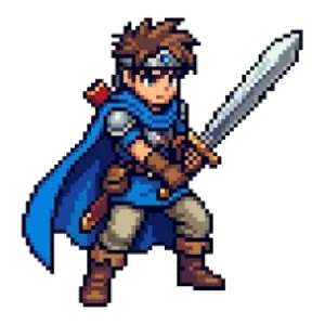

How to Make Pixel Art Icons and Logos That Stand Out on Social Media, Streams and Channels
On a smartphone, a social media profile picture or video channel icon is displayed at about the size of your thumbnail. To show people “what this account is about” in such a small space, clear shapes and colors matter more than fine detail.
Pixel art was designed to look good at small sizes in the first place, which makes it a great fit for icons and logos. This article walks through the thinking and the steps, one by one.
Why pixel art works well for icons
- Shapes are built from a small number of pixels, so they hold up even when scaled down
- A limited palette keeps the look crisp and clear
- The retro feel suits game, music and creator accounts
- Next to other icons, it tends to catch the eye more than a photo or a detailed illustration
Step 1: Decide on one thing you want to communicate
An icon is small, so it can’t carry much information. Pick just one of the following:
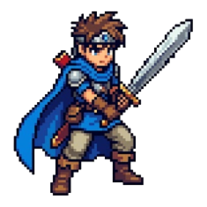
- Yourself (a character or a portrait)
- Your genre of activity (games, music, cooking, travel, etc.)
- Your name or initials
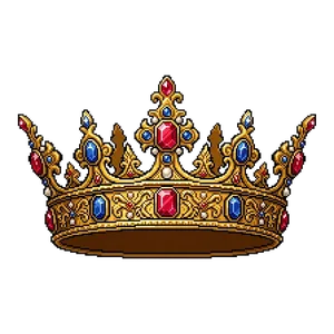
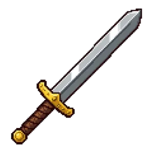
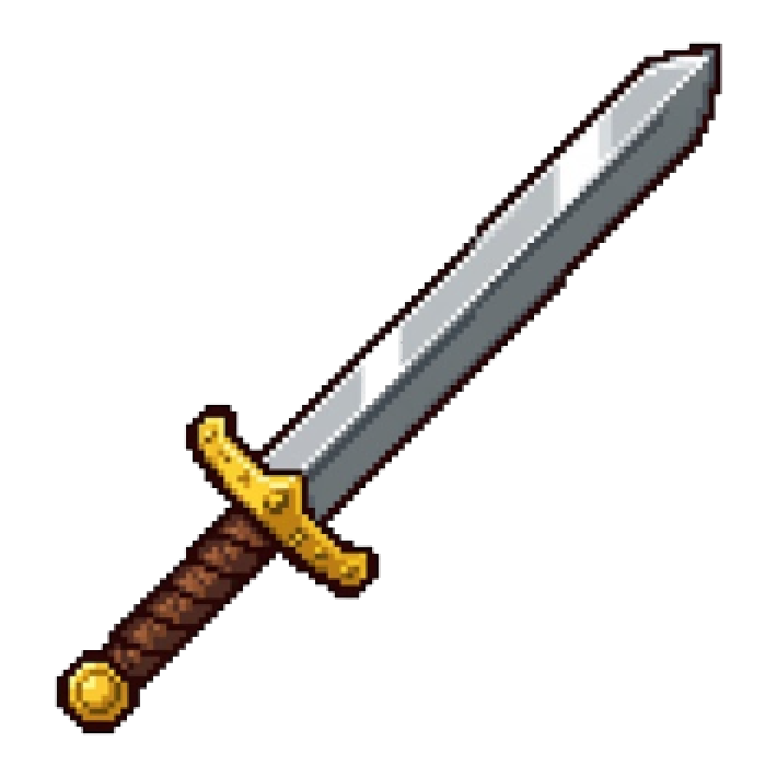
For example, a sword or a crown for a game channel, or a musical note or an instrument for a music account. Choosing one picture that shows the genre at a glance makes you easier to remember. Among the assets on Otomusu, items such as “Iron Sword,” “Crown” and “Crystal Ball” are good examples of motifs that work well in an icon.
Step 2: Check the size and the shape it will be displayed in
Each service displays icons at a different size and in a different shape.
- Many social networks crop a square image into a circle
- The four corners get cut off, so keep the important parts of the picture inside the central circle
- Export a square image at a generous, larger size, and it will work on almost any service
If you create your pixel art at a small size and then enlarge it by a whole-number multiple when exporting, it won’t turn blurry. (For tips on enlarging, see Tips for Cleanly Enlarging and Editing Pixel Art Assets.)
Step 3: Choose the background and colors
- Use a solid-color background: Patterns or photos make your main subject hard to see when the icon is shown small
- Create a brightness contrast between subject and background: If the subject is bright, make the background darker, and so on, so the two are clearly separated
- Limit yourself to 3–5 colors: Too many colors look cluttered once the image is scaled down
- Match the overall feel of your account: Using colors that match your header image and video thumbnails gives a sense of unity
For choosing colors, see also Tips for Choosing Colors in Pixel Art.
Step 4: Make the silhouette clear
Because icons are displayed small, it’s important that they can be recognized by their outline shape.
- Make the subject’s outline stand out from the background, either by surrounding it with a slightly darker line or by changing its brightness relative to the background
- Boldly leave out fine patterns and small decorations
- Don’t fill the whole canvas; leave a little margin so nothing gets cut off when the image is cropped into a circle
Step 5: Things to watch out for when adding text
If you include text as part of a logo, keep the following in mind.
- Keep it to 2–4 characters. With the alphabet, you can also use just the initials
- Choose thick, generously spaced lettering so it stays readable at small sizes
- Make the brightness difference between the text and the background large
- A pixel font can look jagged if its size doesn’t match the canvas. Enlarge it by a whole-number multiple
If you want to put text inside your pixel art, you can use the site’s Pixel Art Text Tool or the Icon Maker, which lets you create icons easily.
Step 6: Shrink it down and check
Once it’s made, check it at the same small size it will actually be displayed.
- Shrink the image: can you still tell what it is at about the size of a thumbnail?
- View it on both a white and a black background (dark mode): does it stand out awkwardly?
- Crop it into a circle: are any important parts cut off?
If it looks hard to read, reduce the fine details and make the color differences clearer.
Examples to avoid
- Cramming in too much detail, so it’s impossible to tell what it is once shrunk
- Using similar brightness for the background and the subject, so the outline disappears
- Including too much text to be readable
- Looking too similar to an existing character or logo (it’s safer to change the combination of features before you publish)
Checking before you use assets
If you use the site’s pixel art assets as part of an icon or logo, check the permitted scope in the Terms of Use. Some uses, such as selling merchandise made from an asset as-is or registering it as a logo (trademark), may not be allowed.
Summary
- Narrow your icon down to one thing you want to communicate
- Use a square image and place the important parts inside the central circle
- Use a solid background, 3–5 colors, and a clear brightness difference from the subject
- Keep text short, bold and easy to read
- Check it at its actual small size before using it
To get started, try drawing a circle with a pencil and sketching just one main subject inside it. Once the shape is decided, adding color in a pixel art editor makes it easy to keep going without hesitation.
Pixel art mentioned in this article


Terms of use for the assets
- Free
- No registration
- Commercial use OK
- Edits OK
- Credit optional
- No usage report needed
See the terms of use for details.
Related articles
- How to Use Pixel Art on Flyers, Posters and Business Cards: A Resolution Guide
- How to Fix White Edges on Transparent PNGs: Background Matching and a Pre-Placement Checklist
- Pixel Art Character Design for Beginners: Proportions, Color Count and Silhouette
- How to Use Pixel Art in YouTube Thumbnails: Eye-Catching Design Tips