


Pixel Art Character Design for Beginners: Proportions, Color Count and Silhouette
Pixel art characters are made of tiny dots, yet you recognize “that’s the character” at a glance. The reason isn’t that they are drawn in fine detail. It’s that they limit the elements used to tell them apart.
This article introduces the basics of design that will help whether you’re creating your own pixel art characters or choosing ready-made assets. It uses no difficult techniques and is organized in the order you’d actually think through a design.
Step 1: Decide the head-to-body ratio
In pixel art, the balance between head and body (the head-to-body ratio, or “heads tall”) changes a character’s impression dramatically.
- 2–3 heads tall (chibi characters): The face is large, so expressions come across easily. They feel cute and approachable, and they stay readable even at small sizes.
- 4–5 heads tall: Often used for game protagonists. They have good movement balance, and differences in equipment are easy to show.
- 6 heads tall or more: They feel mature and cool. At small sizes, though, the face is only a few dots, which makes expressions hard to show.
If you’re unsure, we recommend starting with 2–3 heads tall. Even at a small size, the features of the face and body are less likely to get crushed.
Step 2: Make the character recognizable by silhouette
A good character design is said to be one where you can tell who it is even when it’s filled in solid black. That’s the idea behind a silhouette.
The easiest way to change a silhouette is to add distinguishing features to the outline of the head and back.
- Change the shape of the head with a hat, helmet or similar
- Add parts that stick out from the body, such as a cape, a long tail or wings
- Change the overall shape with something held in the hand, such as a weapon, a staff or a bag
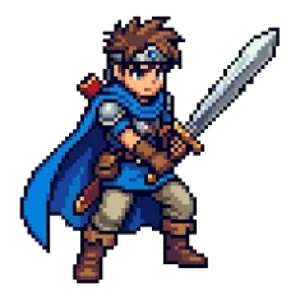
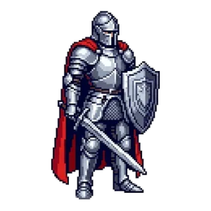
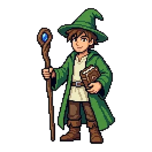
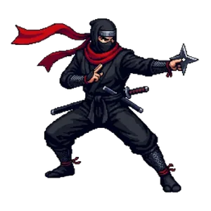
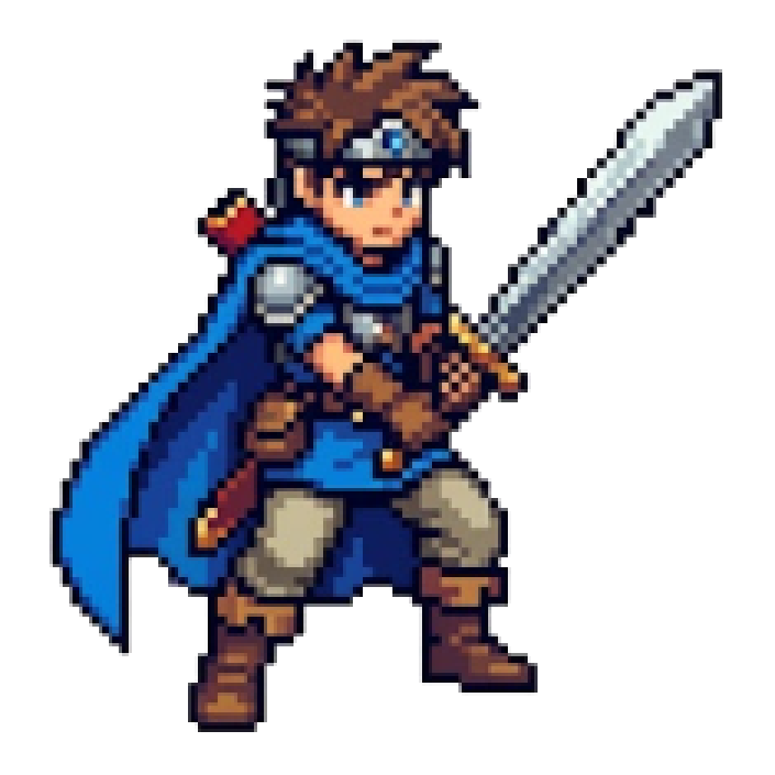
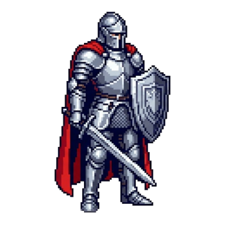
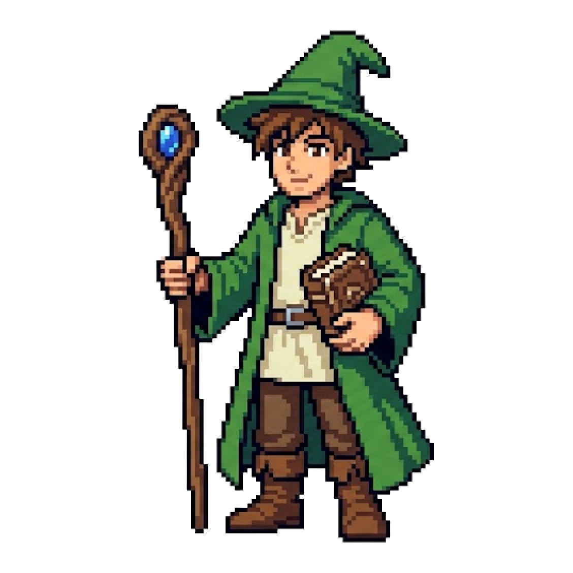
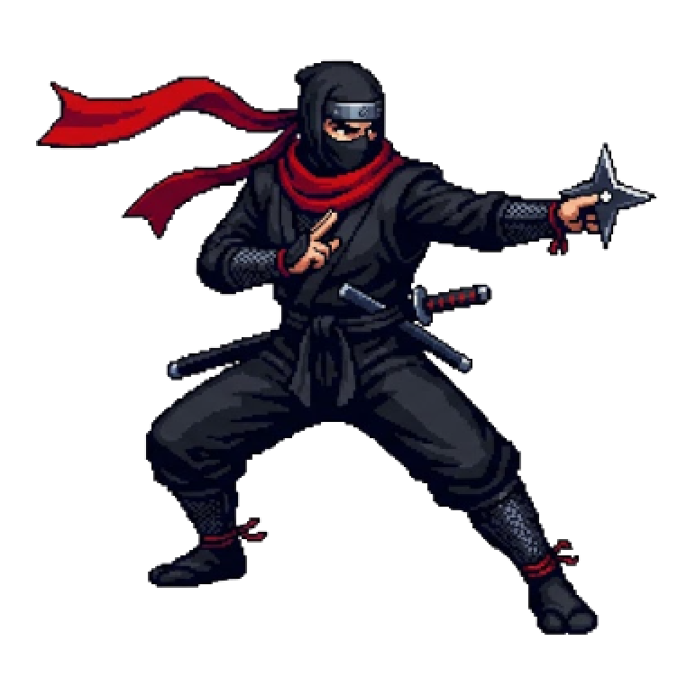
For example, line up the site’s “Hero” asset next to the Young Wizard, the Knight and the Ninja, ignoring color, and they clearly look different thanks to the shape of the hat, the items they carry and the width of the body. When you create several characters, bring out these differences on purpose.
Step 3: Limit the number of colors
The basic rule in pixel art is to use as few colors as possible. With too many colors, shapes look blurry in a small image.
- Base colors: Limit them to 3–4 colors for skin, hair and clothes.
- Shadow and light: For each color, add just one slightly darker shade and, if needed, one lighter shade.
- Lines (outline): Rather than pure black, use a dark color matched to each area, such as dark brown or dark navy, for a softer look.
I also explain how to choose colors in more detail in Tips for Choosing Pixel Art Colors.
Step 4: Express the face with just “dots”
The face of a small character is mostly dots and lines.
- Eyes: Use a dot of 1–2 pixels, and placing them slightly below the center of the face makes the character look cute.
- Mouth: A 1-pixel line is enough. Sometimes there is no mouth at all.
- Cheeks: Placing 1–2 pixels of a reddish color gives a gentle impression.
- Eyebrows: Just having them makes anger, surprise or trouble come across clearly.
An expression is conveyed by a difference of only a few dots. Shifting the eyes by just 1 pixel changes the impression greatly.
Step 5: Pick just one “signature feature” for the character
To make the character memorable at a glance, choose just one signature feature.
- A conspicuous accessory, such as a red headband, a big hat or a long scarf
- Spiky hair or a special hair color
- An item that expresses the character’s backstory (a sword, a staff, cooking tools and so on)
Piling on lots of features actually blurs the impression. Show clearly one element that lets people say, “If I see this, it’s that character.”
Step 6: Think about consistency when characters are lined up
When you use multiple characters in a game or video, keep their appearance consistent when they stand side by side.
- Use the same head-to-body ratio, line thickness and shading style for all characters.
- Match the overall mood of the colors (bright or muted).
- Make differences in size (height) intentionally, according to the characters’ settings.
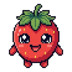
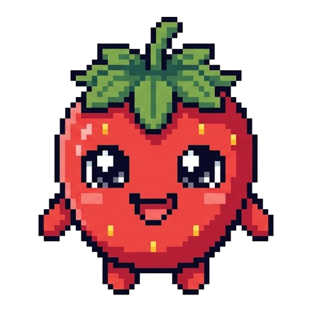
The site’s “Characters” assets are made in the same style, so they don’t look out of place when used side by side. Also, fruit characters like “Strawberry-chan” are an example of giving personality with only a round shape and a face.
You can also use the Character Maker to make your own
If drawing from scratch is hard, the Character Maker lets you pick and combine parts, so you can try out different hair, clothes and items. If you make several and line them up, you’ll get a feel for which combinations stand out.
Check that it doesn’t resemble an existing character
Once the design is decided, check whether it resembles an existing character. In particular, a standard combination (the same color, hairstyle, clothes and held item all together) can end up looking similar unintentionally. Before publishing, changing one combination of features gives you peace of mind.
Summary
- For small sizes, 2–3 heads tall is recommended.
- Change the hat, held items and body shape so the character can be told apart by silhouette alone.
- Limit colors to 3–4 for skin, hair and clothes, and add one shade for shadow.
- A few dots are enough for the face. The position of the eyes changes the impression.
- Decide on one signature feature, and also value consistency when characters are lined up.
First, try deciding one character in the order of head-to-body ratio, color and signature feature, and draw it on paper or on screen. When it’s done, line it up with the site’s assets and compare how easy it is to tell them apart, and you’ll see what to improve.
Pixel art mentioned in this article
Terms of use for the assets
- Free
- No registration
- Commercial use OK
- Edits OK
- Credit optional
- No usage report needed
See the terms of use for details.
Related articles
- How to Use Pixel Art on Flyers, Posters and Business Cards: A Resolution Guide
- How to Fix White Edges on Transparent PNGs: Background Matching and a Pre-Placement Checklist
- How to Make Pixel Art Icons and Logos That Stand Out on Social Media, Streams and Channels
- How to Use Pixel Art in YouTube Thumbnails: Eye-Catching Design Tips