

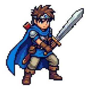

Pixel Art Color Tips: How to Limit Your Palette and Make Your Sprites Look Polished
Whether pixel art looks polished or not comes down to how you choose your colors. Just by limiting the colors you use and following a few rules, you can make your art look dramatically more cohesive. This article covers the basics of choosing colors.
Start by Deciding How Many Colors to Use
A common beginner mistake is using too many different colors. With too many colors, the picture looks scattered and loses the tight, crisp feel that pixel art is known for. Here are some rough guidelines:
- Items and small characters: 6–12 colors
- Full characters: 12–24 colors
- Backgrounds and scenes: 24–48 colors
Old game consoles had limits on how many colors they could display. The art that was cleverly crafted within those constraints is what created the classic “pixel art look.” Setting a limit on purpose helps your work come together.
3–4 Colors per Object: Light, Mid and Dark
For a single object (an apple, for example), prepare the following colors:
- A light color (the surface hit by light)
- A base color (the normal surface)
- A dark color (the shadowed surface)
- An even darker color (the outline or the deepest shadow)
If you apply these light, mid and dark steps consistently with light coming from the same direction, the object looks three-dimensional. Decide on a light direction—for example, “from the upper left”—and use it for all the other parts too.
Shift the Hue (Hue Shifting)
When you create shadows, simply “making the color darker” results in a muddy, dull color. The trick to making them look good is to shift the hue slightly.
- Shift lit surfaces toward yellow (the warm direction).
- Shift shadowed surfaces toward blue or purple (the cool direction).
For a red apple, for example, make the lit area an orange-leaning red and the shadow a purplish red. This gives a much richer color than just changing the brightness of the same red.
Don’t Make Outlines Pure Black
A pure black outline makes your art look hard, like a cut-out sticker. Using a color slightly darker than the fill (for example, a deep reddish brown for a red object) gives a softer finish. If you want the sprite to blend into the background, bring the outline color closer to the background color.
Create Color Variations
Changing the colors of the same artwork to make stronger versions of an enemy, or different seasons, is a technique commonly used in games. With the Color Variation Maker, you can:
- Generate color variations at once by rotating the hue in equal steps
- Apply effects such as sepia, monochrome, negative and Game Boy–style
- Change only the colors you select, such as clothes or hair, leaving skin and eyes as they are
Decide on a Palette and Reuse It Across Your Whole Project
Another approach is to decide the colors for your entire project up front as a palette. If you draw characters, backgrounds and items using only the colors in that palette, everything blends together naturally. Ready-made palettes are available online—try searching for “pixel art palette.” Be sure to check the license before using one.
Summary
- Limit the number of colors.
- Use 3–4 colors per object: light, mid and dark.
- Don’t just darken shadows—shift the hue as well.
- Don’t make outlines pure black.
If you’re creating pixel art from a photo, you can get the same effect by reducing the “number of colors” in the Pixel Art Converter. For more on dot size, see also How to Choose the Right Pixel Art Size.
Terms of use for the assets
- Free
- No registration
- Commercial use OK
- Edits OK
- Credit optional
- No usage report needed
See the terms of use for details.
Related articles
- How to Use Pixel Art on Flyers, Posters and Business Cards: A Resolution Guide
- How to Fix White Edges on Transparent PNGs: Background Matching and a Pre-Placement Checklist
- How to Make Pixel Art Icons and Logos That Stand Out on Social Media, Streams and Channels
- Pixel Art Character Design for Beginners: Proportions, Color Count and Silhouette